GBG instinct
My role: UX/UI design
Duration: 3 months
Client: GBG
OVERVIEW
GBG is a Platform that helps users and new customers to sign-up to be swift and straightforward. The business needs to meet their expectations – and at the same time safeguard against application fraud and other financial crime. GBG Instinct is a service offered by GBG to client companies.
GBG Instinct intelligently compares the information provided during registration against rich layers of identity reference data - account numbers, prior purchases or applications, card details – even previous behaviors, as well as basic information such as name and address.
As a company client, you will be able to make a quick, risk-based decision on new applications, based on your own rules and requirements. Which means no delays for good customers, high fraud identification rates – and far fewer time-wasting false positives.
My role and responsibilities
"Attending the 6-week training amidst a 3-month project was a challenging experience. Although I was unable to attend the initial workshop with the client in Australia, I took on the task of investigating and improving on almost all of the user flows on the web application.
What I have done
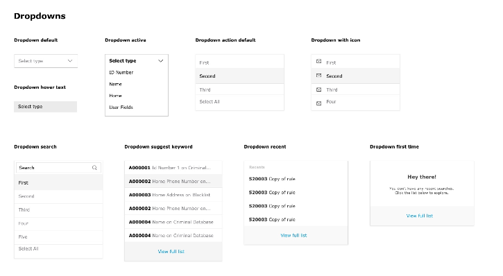
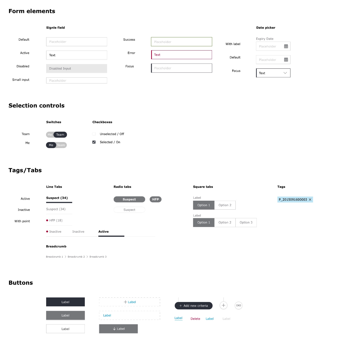
Created a style guide based on the brand book and managed the design system, while communicating with the developers
Designed a new UI theme, including high-fidelity mockups and interactive prototypes
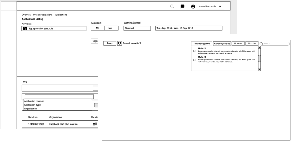
Focused on wireframes to define the UX flow based on the user journey, spending most of my time on the dashboard, navigation, and advanced search features
Participated in weekly meetings with the Product team in Australia through conference calls to discuss different design concepts and gather feedback.
“To rethink and redesign a new GBG Instinct for future generations.”
Challenge
User experience opportunities
Connect our user to the right information and service at the right time.
Increase new client partnerships and applications.
Leverage technology to provide value and accuracy in their workflow
Problem
Before starting the project, my team and I discussed to find big problems based on the current platform. I write down some points bellow.
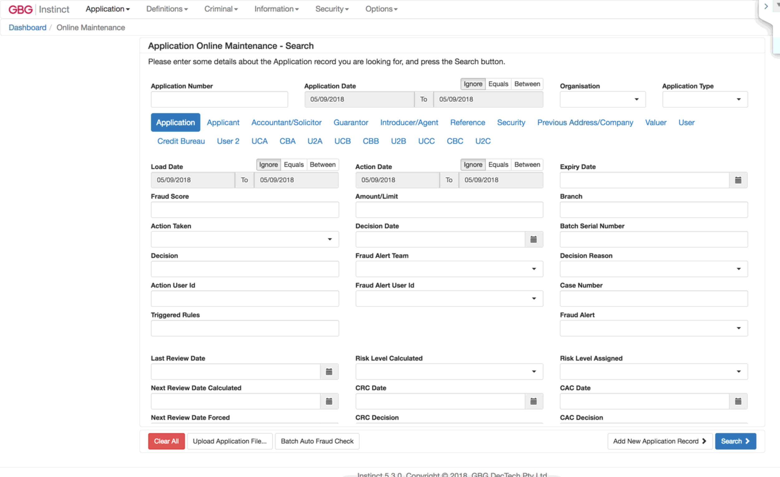
A lot of information and the table is not interesting, might as well be an excel sheet
Too much back and forth from one information to another. It takes user more time to finish the task
Too many rules starting set. User wants to be able to write their own rules
Have into in tiny little windows is annoying and there is not enough space within the text box
User wants to create a community where they can do internal sharing and also collaboration with fraud bureau by sharing reports
Solution
Create an Intuitive UI to guide users reach their goal at the minimum efforts
One of the main criteria for software experience is how effectively and efficiently people can reach those goals. The biggest challenge of creating a software ensuring that users can easily understand your product and and handle it intuitively. They have to know where different functions can be found, how it works and understand different purpose of them
Reduce cross referencing to other action
Users can be very confused if they are faced with too many action buttons and end up doing nothing and just leaving. Choose the most significant action you want your users to take and avoid cross referencing action. If other actions is surely required, use smaller buttons.
Contextual action to serve user needs.
The first thing that need to be considered when building a web app is what resolution to design for. What this really amounts to is deciding how wide your design should be. Maximise the space of your site and avoid having a horizontal and vertical scroll in one page.
Clutter to Clarity
User attention is a precious resource. Cluttering your interface overloads your user with too much information. By Reducing the clutter, we will improve comprehension.
User journey dashboard
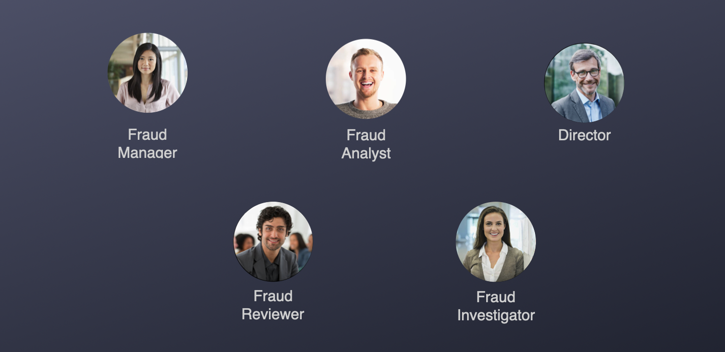
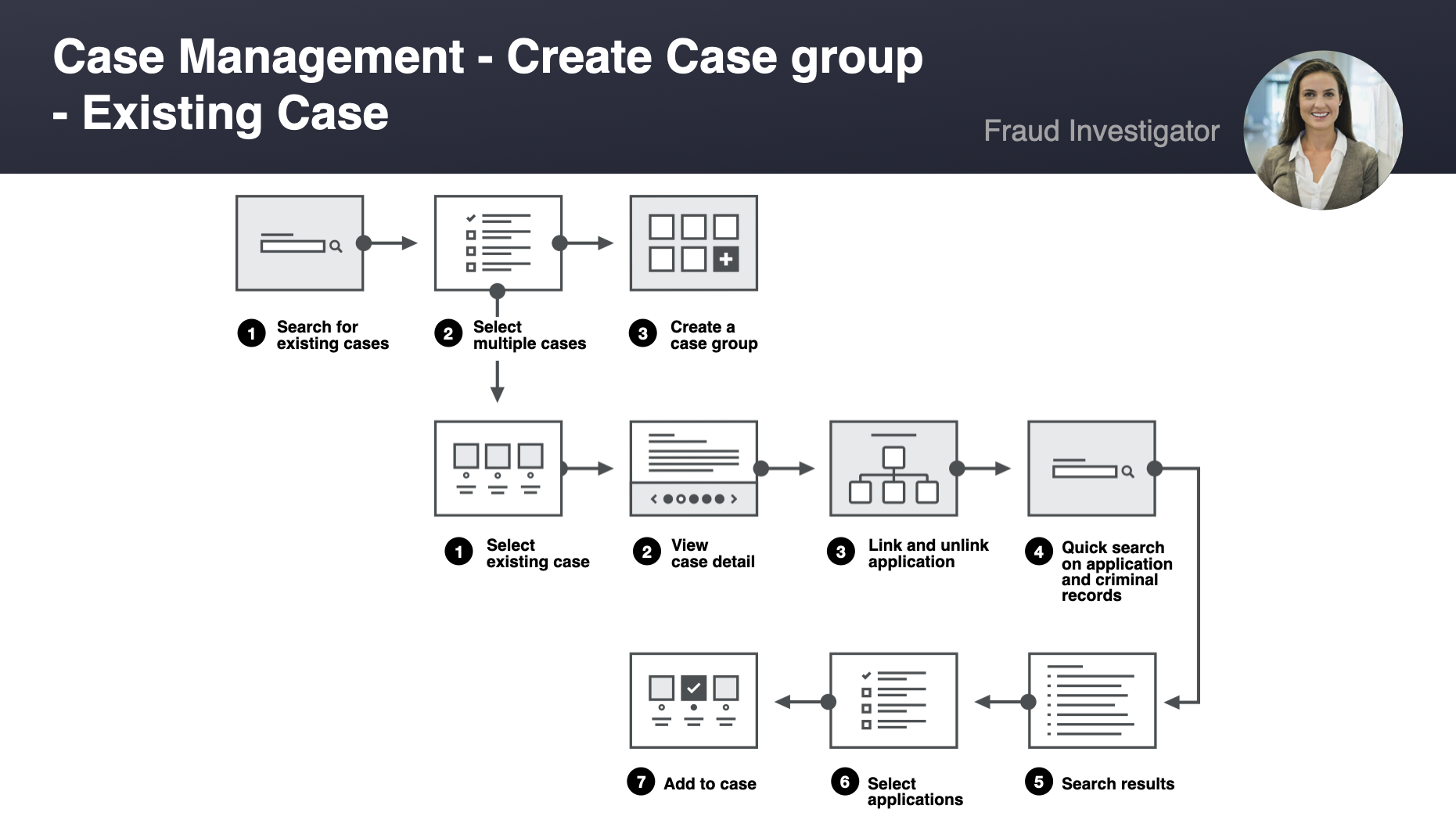
Defined during discovery workshop that will best illustrated how a fraud investigator/reviewer will use the application
Restructure information
Our research led us to prioritize several main issues that needed to be addressed in the existing product:
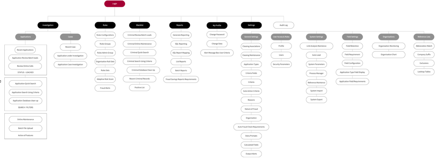
Unintuitive navigation. We needed to overhaul the information architecture of the site to ensure that users could find the information and features they were looking for. We hypothesized that this would result in increased exploration and engagement with the product.
We first addressed the navigation issues by using our card sorting and tree testing results in order to construct a new site map.
With a better understanding of our users and the main issues we needed to address, our team began generating wireframes for each page of the website to explore potential solutions to these problems
Defining the visual language
My role on the team also involved building a pattern library and shaping the overall visual language of the platform. I drew upon our competitor/comparator analysis as well as the Apple Human Interface Guidelines in order to develop a visual interface that would feel familiar, trustworthy, and highlight the most effective aspects of the client's existing brand.
The design
After finished the first exploration of the style guide, I was assigned to design a dashboard
At first glance, I was confused about the information. It was a new field for me... It required me to read all the features to understand the product better.
This site I was not allowed to visit it in the evening. I decided to capture entire screen on this website for further study after work, I listed all the functions on paper, restructure information based on the dashboard, there were too much information and not clear division, users feel very confused and tough to access.
I was restructur the information
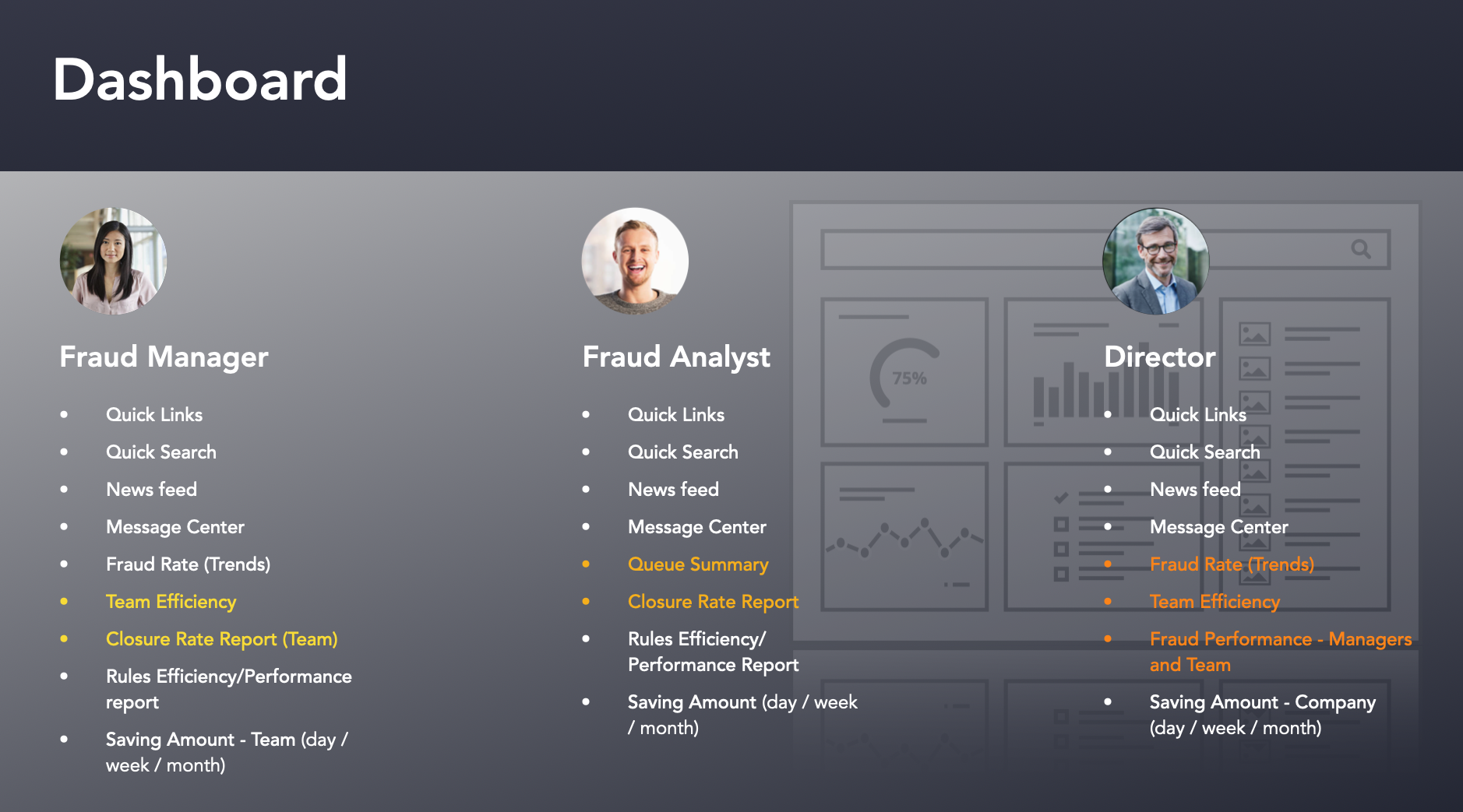
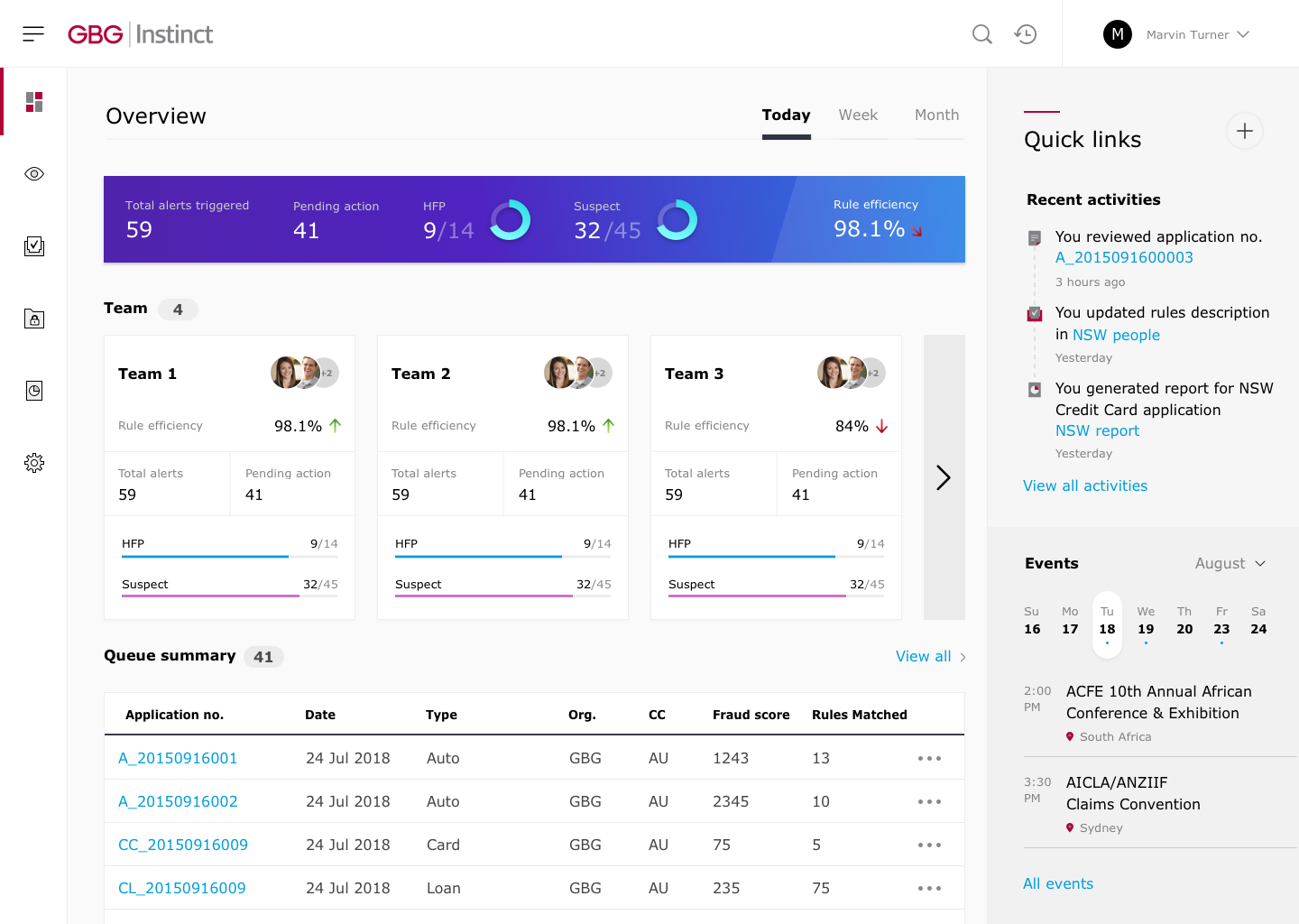
The dashboard in overview is a “home” for user to have a quick understanding what has been and has to be done
After mapping out the user journey, I created two distinct dashboards: the Analyst Dashboard and the Manager Dashboard. One significant difference between the two is the Manager Dashboard's team tracking feature, which required a lot of effort to ensure both full functionality and consistency.
However, the initial feedback on this version was not entirely satisfactory. Some users found it challenging to grasp the critical components of the information architecture. While they could understand it, it might not be presenting the information in a way that aligns with their expectations
After discussing with the team, one of my main goals was to optimize and structure the dashboard. I went through several iterations, considering factors such as color, structure, content, and labeling. We also focused on better utilization of space, which was a major area of improvement.
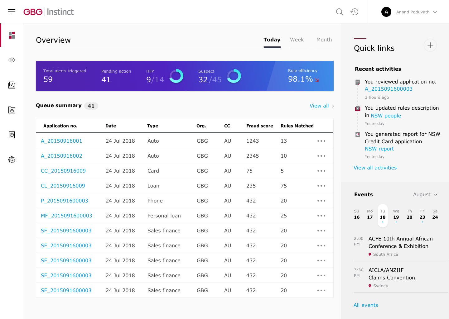
As an example, we made the decision to consolidate multiple charts into a single, compact banner. The insights banner displays data from the system in the form of graphs, making it easier for users to discern trends. This change helped to simplify the dashboard and improve its overall usability.
In the Manager Dashboard, I added an additional widget that provides a quick overview of the team's performance. The widget displays key information such as team size, team member details, rule efficiency, and total alerts.
Dashboard analyst
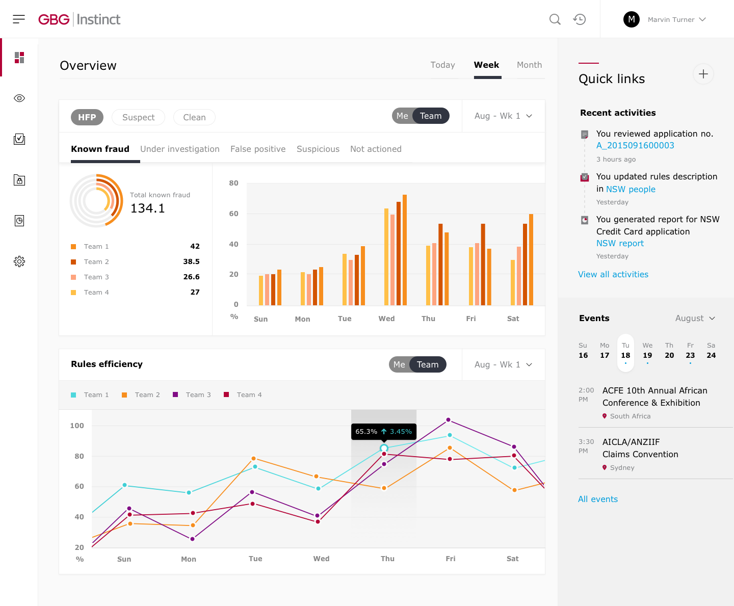
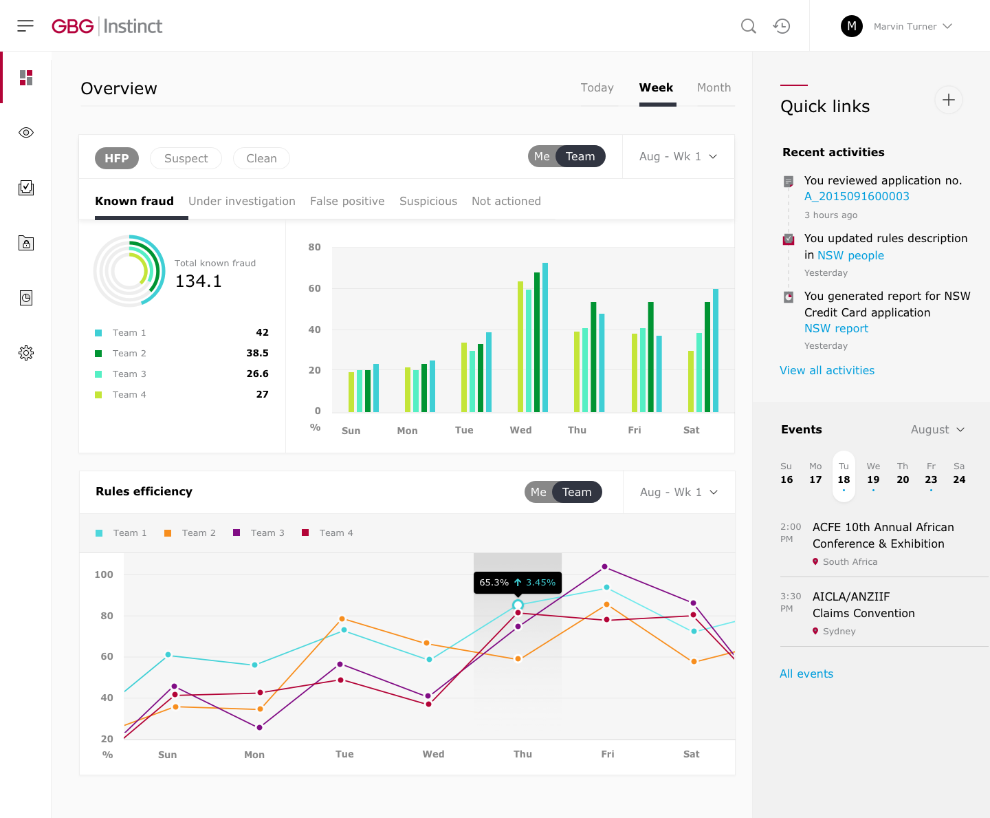
Dashboard manager
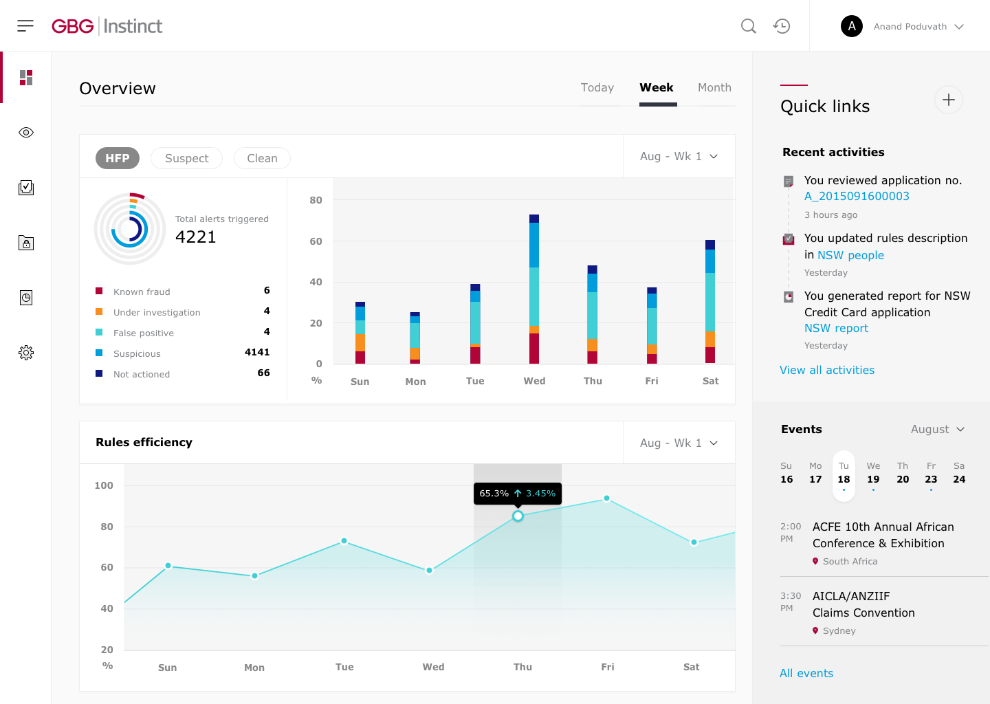
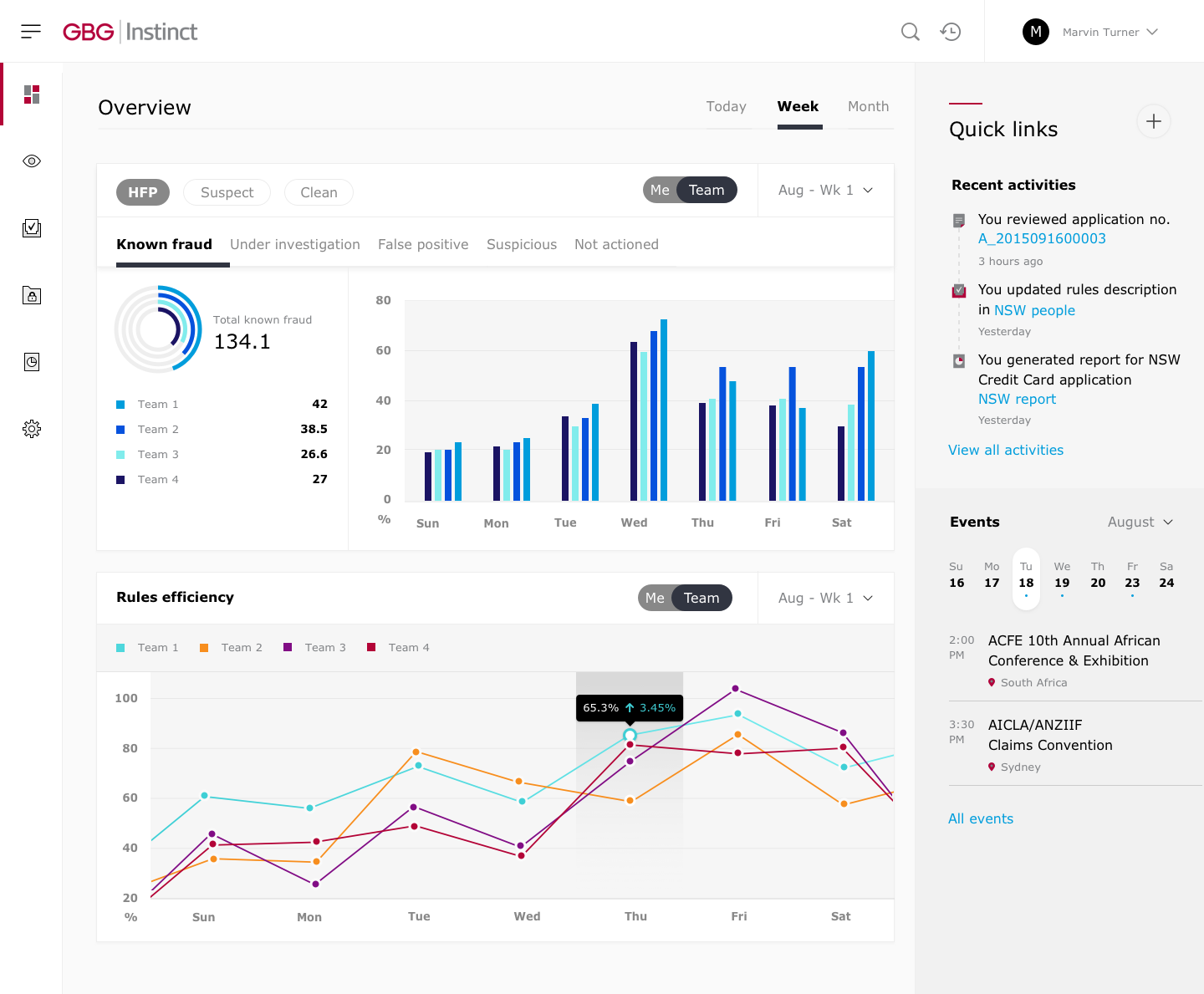
Dashboard - week view
Dashboard analyst
Click through the week view the user will see a different display than today in order to have a comprehensive view for the whole week, I have separated all the application in 1 banner to a different way because this case is required to display all the information of the week in one screen.
Dashboard manager
Dashboard Manager there are many changes in UX. I added a radio tab "me -> team" so that users can switch to see what is happening on their team. The colors on the chart are no longer for applications, it's the team now. The application will be displayed under a tab
Overview widget - This overview widget gives users a quick understanding of the trends in the applications. It consists of:
Total alerts triggered, Pending action, HFP, Suspect, Rule efficiency
Quick link - There is a quick link panel on the right side of the dashboard, consisting of Recent activities quick glance at recent activities links to each activity. Events weekly calendar with indications of events quick glance of events happening soon
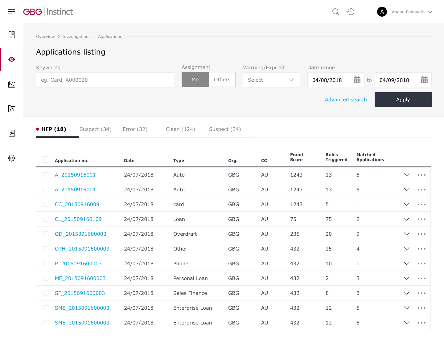
Application listing
This listing view is the default for Applications listing, Rules listing, and Case listing. It gives users a quick view of the modules and their information, as well as allows them to filter and search through them. It consists of History breadcrumb, Screen title, Filters, Tabs, Table
Tabs
Listing screens come with tabs that are made up of main categories in the table. This is so that users can filter through the table easily.
Filters - The listing header comes with filters to search for information from the table below.
CTA - CTAs in listing headers are hyperlinks or solid-colored buttons to contrast against the light-coloured header.
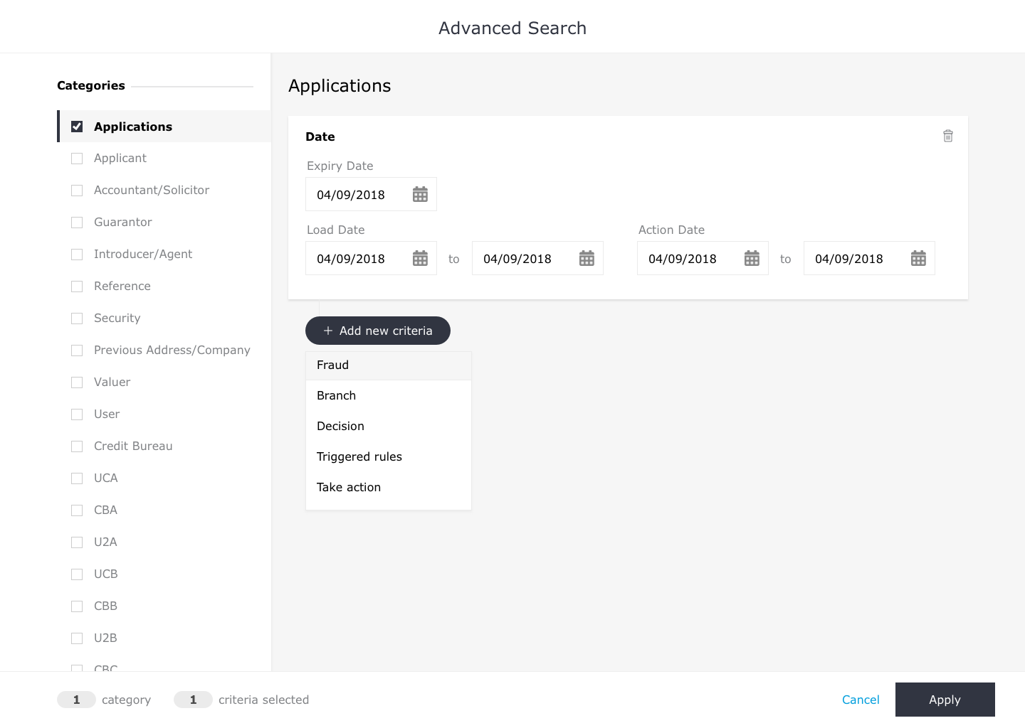
Advanced search
The advanced search navigation consists of application categories as tabs. If a form has been filled within a tab, the respective tab will be checked when users move on to another tab
SForm - Fields in the form are related to the type of form. Eg: Date form only has date pickers as fields.
Add button - When users click on the button in advanced search, a dropdown will appear below allowing them to choose another form type.
What I learned
Working on this project gave me the opportunity to think through some very complex and intriguing problems.
As a UI/UX designer, one of the biggest challenges always comes from lacking of the knowledge of the industry or users. The easiest way is to invest time in talking to clients, users even asked a lot of my friends to understand the specialized knowledge and asking for their feedback.
In this project, I would say half of my learning actually comes from the team that I was working with, they were really patient with me to find out the solution, we worked so hard to understand everything before meting with client. The complicated structure and the intensive process make it a great learning and practice for me.
I’m glad I have been able to leverage research and user journey mapping to understand it and successfully revamped the project, even when the tasks turning to be more and more complicated.
Next?
As a local music product that has been on the market for over 10 years with more than 30 million users, I joined the project to improve its functionality as well as to develop new features


